How Pop-Psychedelic Design Turned the Zodiac Into a Cosmic Visual World
Peter Max’s 1971 Astrologicalendar is more than a brightly coloured vintage calendar.
It is a compact example of how astrology, commercial graphic design, Pop Art and the visual language of the psychedelic era came together at the beginning of the 1970s.
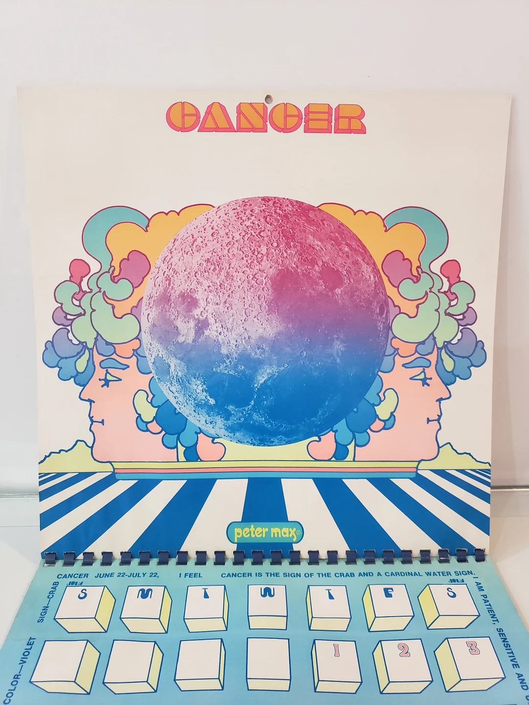
Published by Grosset & Dunlap in 1970 for the 1971 calendar year, the spiral-bound Astrologicalendar organised the year around the twelve signs of the zodiac. Each section combined calendar information with astrological text and a distinctive Peter Max composition. Surviving copies show the intense colour, stars, planets, stylised figures, geometric forms and cosmic imagery closely associated with Max’s late-1960s visual language.
For researchers interested in psychedelic visual culture, the object is useful because it demonstrates something that is easy to overlook when psychedelic art is reduced to concert posters or images associated directly with drugs.
By 1970, psychedelic aesthetics had already moved into ordinary commercial life.
They could appear in a calendar hanging on a wall.
That transition—from countercultural visual experimentation to everyday consumer design—is one of the most interesting things about the Astrologicalendar.
What Was Peter Max’s 1971 Astrologicalendar?
The full title is commonly recorded as The Peter Max 1971 Astrologicalendar.
Despite carrying the year 1971, bibliographic and surviving-object records identify Grosset & Dunlap as the publisher and 1970 as the publication or printing year. One rare-book record describes it as a square, spiral-bound object measuring approximately 305 by 305 millimetres, with the twelve months accompanied by zodiac descriptions and colourful compositions.
The unusual word Astrologicalendar effectively combines astrology and calendar into a single title.
That describes the object well.
Instead of merely placing decorative zodiac symbols beside conventional month pages, Max built the calendar around astrological identity. Aries, Taurus, Gemini, Cancer and the remaining signs function as visual subjects rather than minor decorations.
Surviving examples show that these pages were substantial enough to function almost like individual prints. That helps explain why complete examples can now be harder to encounter than detached zodiac pages. Dealers in vintage examples regularly offer individual signs rather than intact calendars.
This matters to researchers because an individual page tells only part of the story.
The complete object reveals how Max constructed a sequence of twelve related but visually distinct identities across an entire year.
Why Peter Max Was the Right Artist for a Cosmic Calendar
Astrology was not an arbitrary theme added to Max’s work.
Cosmic imagery had already become central to his artistic identity during the late 1960s.
According to Peter Max Studio’s biographical chronology, Max developed an interest in astronomy when he was young, and celestial themes continued to appear throughout his later work. His studio describes the late 1960s as the period in which his fascination with inner and outer space merged into what became known as his “Cosmic ’60s” imagery.
The Moon, stars, planets, radiant suns and vast cosmic spaces therefore belonged naturally within his visual vocabulary.
His fascination with space also appeared in work connected with the Apollo 11 Moon landing in 1969. Poster House’s later exhibition on Max noted how frequently concepts of space, time and history appeared in his commercial graphics, while Peter Max Studio records his production of commemorative Moon-landing imagery.
The Astrologicalendar sits directly within this period.
Astronomy, astrology, countercultural spirituality and futuristic optimism could overlap visually even though they are intellectually different subjects.
The calendar does not require viewers to keep those categories neatly separated.
A planet can function as an astronomical object, an astrological symbol and a graphic shape at the same time.
That ambiguity is part of the design’s appeal.
Understanding Peter Max’s Pop-Psychedelic Style
Calling Max’s work simply “psychedelic” does not fully describe what makes it recognisable.
His visual language combined several characteristics that worked especially well in mass reproduction.
Saturated, flat areas of colour
Max frequently used strong colour relationships rather than subtle naturalistic shading.
Faces, clothing, planets and backgrounds could be separated by bold regions of pink, orange, blue, yellow or green.
That approach gives the work an immediate graphic impact.
It also makes the image readable at a distance—an important quality for posters, calendars, advertisements and commercial illustration.
MoMA’s collection includes several works by Max from the 1960s, including Psychedelic Cloud from 1967, an offset lithograph demonstrating how firmly his psychedelic graphic work belonged to the history of printed design rather than being restricted to one-off paintings.
Cosmic imagery
Stars, planets, moons and celestial spaces appear repeatedly across Max’s work.
In the Astrologicalendar, these motifs become particularly appropriate because the zodiac already provides a ready-made celestial framework.
The imagery therefore feels integrated rather than decorative.
Stylised human figures
Max’s people are rarely concerned with anatomical realism.
Bodies can stretch, float or become simplified into flowing outlines.
Hair may transform into flowers, clouds or ornamental shapes.
This gives the figures the feeling of inhabiting a symbolic world rather than an ordinary physical environment.
Graphic rather than realistic space
Traditional Western perspective tries to make a flat surface appear three-dimensional.
Max often does something else.
Large circles can sit behind figures without behaving like realistic planets. Flat geometric bands can become horizons. Figures can occupy impossible spatial relationships without the scene feeling like a mistake.
The viewer understands the image through graphic relationships, not realistic architecture.
Typography becomes part of the picture
The names of zodiac signs are not merely labels.
Letterforms contribute to the mood.
Their shape, colour and placement participate in the composition, reflecting a broader characteristic of psychedelic graphic design in which the boundary between illustration and typography became unusually fluid.
The Victoria and Albert Museum notes that psychedelic poster designers of the 1960s revived and transformed earlier Art Nouveau motifs while experimenting with intense colour and unconventional graphic treatment.
The Zodiac as a Visual Design System
One of the most useful ways to study the Astrologicalendar is not as twelve unrelated pictures but as a visual system.
Each zodiac sign already arrives with a cultural identity.
Aries has the ram.
Taurus has the bull.
Gemini has the twins.
Cancer has the crab.
Leo has the lion.
And so on.
Max did not need to invent those associations. His creative problem was to translate them into his own visual vocabulary.
Surviving pages show how dramatically he could vary the approach.
An Aries composition uses a highly stylised ram against bold overlapping geometric fields. A Cancer design centres a large moonlike circular form between mirrored profiles. Sagittarius becomes a brightly coloured travelling figure moving across a circular cosmic field.
The result is useful for anyone studying graphic communication.
Every page has two jobs.
It needs to remain recognisably Peter Max, while also becoming recognisably Aries, Cancer, Sagittarius or another individual zodiac identity.
That balancing act is one reason the calendar is more interesting than a collection of psychedelic decoration.
It demonstrates branding at two levels simultaneously:
the identity of the artist
and
the identity of each astrological sign.
Astrology and the Visual Culture of the “Age of Aquarius”
The timing of the calendar also matters.
Astrology had become highly visible within sections of the Western counterculture by the end of the 1960s. Ideas about cosmic consciousness, Eastern religion, alternative spirituality and the so-called Age of Aquarius circulated alongside music, fashion, environmentalism and experimentation with altered states.
The surviving promotional language associated with the Astrologicalendar explicitly invoked the “Age of Aquarius” and a coming “Golden Age,” placing the product within this broader countercultural vocabulary.
For researchers, the important point is not whether astrology itself has scientific validity.
The cultural question is different:
Why did astrology become such a powerful visual and symbolic language for this generation?
It offered a ready-made system for talking about identity, cosmic connection, time and human personality.
Graphic artists could turn those abstract ideas into suns, planets, faces, stars and archetypal creatures.
The zodiac was therefore almost perfectly suited to psychedelic design.
It combined personal identity with the universe.
Psychedelic Art Did Not Simply Mean Art Made Under Psychedelics
This distinction is essential.
A researcher should not assume that an artwork is evidence of drug use simply because it is described as psychedelic. For Psychedelics Arts work which are drugs like LSD blotter, read this product description of LSD blotter in Swedish for better understanding.
“Psychedelic art” developed into a recognisable visual language involving intense colour, distorted or flowing forms, unusual typography, optical effects, cosmic imagery and references to altered perception.
Those characteristics could be deliberately produced by professional designers regardless of whether a particular work was created under the influence of a psychoactive substance.
The V&A describes the psychedelic graphic movement of the 1960s through formal design characteristics and connects it to both earlier Art Nouveau sources and designers working in Britain and the United States.
That distinction is particularly important with Peter Max.
Max was a highly successful commercial graphic artist as well as a countercultural icon.
Poster House describes him as an extraordinarily commercially successful Pop artist to emerge from the psychedelic period and emphasises how his visual language spread across advertising, posters, packaging and other consumer products.
The Astrologicalendar belongs to that intersection.
It is psychedelic-looking commercial design.
That does not make it less interesting.
It arguably makes it more historically useful.
When Counterculture Becomes Consumer Culture
One of the most revealing things about Peter Max is how successfully his imagery travelled.
A visual language associated with youth culture and psychedelic experimentation could also sell products.
Poster House’s Peter Max: Cosmic Advertising exhibition specifically examined this relationship between his colourful cosmic imagery and commercial design. His work appeared across a remarkably wide range of consumer and promotional contexts.
The calendar demonstrates that transformation in an especially intimate way.
A concert poster belongs to an event.
A political poster belongs to a cause.
A calendar belongs inside everyday life.
Someone could wake up, look at the date and encounter a piece of psychedelic Pop design every morning for an entire year.
That is a different kind of cultural penetration.
The visual language had moved from the street, club or countercultural gathering into the domestic environment.
Why the Astrologicalendar Matters to Psychedelic Researchers
For a researcher studying psychedelia, the calendar can be useful in at least four different ways.
It documents psychedelic visual language after the peak of the 1960s
The calendar was produced at the threshold between the late 1960s and early 1970s.
It therefore helps researchers examine what happened to psychedelic design once the initial countercultural explosion had already become widely recognisable.
Instead of disappearing, the style became reproducible.
It shows the relationship between psychedelia and commercial design
Peter Max is particularly useful because his work crossed boundaries between fine art, graphic design, advertising and merchandise.
MoMA holds several of his 1960s works in its Architecture and Design collection, while Poster House has examined his commercial output as a substantial design history in its own right.
It connects psychedelic aesthetics with cosmic thinking
Stars and planets were not incidental motifs in Max’s career.
His longstanding interest in astronomy and his repeated cosmic imagery make the Astrologicalendar part of a broader exploration of outer space, inner consciousness and utopian possibility.
It demonstrates how psychedelic imagery could organise information
This may be the most overlooked feature.
A calendar is fundamentally an information-design object.
It needs to organise dates.
The Astrologicalendar adds another layer: zodiac categories.
And then another: illustration.
Max therefore had to combine functional information with an unusually expressive aesthetic.
Researchers interested in graphic design can ask whether the psychedelic imagery clarifies, competes with or transforms the practical function of the calendar.
That is a much richer question than simply asking whether the pictures look “trippy.”
Peter Max and British Psychedelic Visual Culture
For a UK audience, Max is particularly interesting when placed beside—not collapsed into—the British psychedelic design tradition.
The British scene developed its own visual language through designers and publications connected with London’s underground culture.
The V&A identifies Michael English and Nigel Waymouth’s Hapshash and the Coloured Coat among the designers who experimented with rich silkscreen colour in the 1960s. Its archive of Oz magazine also preserves psychedelic covers by artist Martin Sharp and documents the magazine’s role in London counterculture between 1967 and 1973.
There are clear visual parallels with American psychedelia: saturated colour, revived ornamental forms, unconventional typography and resistance to restrained modernist design.
But the contexts were not identical.
British underground graphics were closely connected with clubs, music venues, alternative publishing and political counterculture.
Max became unusually effective at translating similar feelings of visual liberation into mainstream American commercial culture.
The Astrologicalendar is therefore useful for transatlantic comparison.
Instead of asking which country produced the “real” psychedelic style, researchers can examine how similar cultural impulses were transformed by different media, markets and design traditions.
Was Peter Max a Pop Artist or a Psychedelic Artist?
Trying to place Max in only one category creates unnecessary problems.
His work overlaps several histories.
MoMA categorises his works within its modern art and design collections. Poster House approaches him through graphic and commercial design. Museums and commentators regularly connect his late-1960s work with both Pop and psychedelic culture.
The Astrologicalendar itself makes the overlap obvious.
Its reproducibility belongs to commercial graphic design.
Its mass-cultural imagery connects with Pop.
Its colour, cosmic symbolism and visual distortion connect it with psychedelia.
Its zodiac framework connects it with the period’s interest in astrology and alternative spirituality.
The object becomes more understandable when those categories are treated as overlapping rather than competing.
What Researchers Should Not Claim From the Calendar
Historical objects become less useful when they are forced to support conclusions they cannot demonstrate.
The Astrologicalendar does not, by itself, prove that psychedelic drugs caused Peter Max’s visual style.
It does not demonstrate that people who bought the calendar believed literally in astrology.
And its cosmic imagery cannot be treated as evidence that its audience shared one coherent philosophy of consciousness.
Those claims would require additional evidence.
What the object does demonstrate is more concrete.
A major commercial publisher produced a full Peter Max astrological calendar for 1971.
The zodiac was translated into Max’s highly recognisable colour and cosmic imagery.
And psychedelic visual conventions had become commercially viable enough to enter ordinary consumer products by the beginning of the decade.
That is already historically significant.
How to Identify and Study an Original Astrologicalendar
Researchers examining surviving copies should pay attention to the object rather than only the individual illustrations.
Bibliographic descriptions identify the original as a roughly 12-inch-square spiral-bound publication issued by Grosset & Dunlap for 1971.
Important features to document include:
the front and rear covers;
the binding;
whether all twelve zodiac sections remain present;
calendar text and date information;
publisher information;
printing characteristics;
signs of pages being removed;
and annotations made by the original owner.
A used calendar may actually contain information that a pristine example does not.
Handwritten appointments, birthdays or notes can show how a visually extraordinary object functioned as an ordinary calendar.
For cultural historians, that tension between art object and used household object can be extremely valuable.
Why Complete Copies Matter
Individual zodiac sheets are visually attractive and easy to frame.
But removing them changes the historical object.
A detached Sagittarius page can tell us about Sagittarius imagery.
A complete Astrologicalendar can tell us how Max constructed a twelve-part visual sequence, how a user moved through the year and how art interacted with calendar information.
This is why researchers should distinguish between studying a Peter Max zodiac print and studying the 1971 Astrologicalendar as a designed object.
The images may be identical.
The research question is not.
The Lasting Value of Peter Max’s Astrologicalendar
Peter Max’s 1971 Astrologicalendar captures a moment when psychedelic visual culture was no longer confined to experimental posters or underground events.
It had become a language that could organise the year.
The object brings together several currents that defined the period: fascination with the cosmos, astrology, spectacular colour, Pop Art, alternative spirituality, graphic experimentation and increasingly sophisticated commercial reproduction.
For psychedelic researchers, its greatest value may therefore have little to do with asking whether the calendar itself is “psychedelic enough.”
A more productive question is:
What happens when an aesthetic born around cultural experimentation becomes familiar enough to enter everyday life?
The Astrologicalendar provides a remarkably clear answer.
Psychedelia did not simply remain an image of altered consciousness.
By 1971, it could also become typography, branding, information design, merchandise and domestic decoration.
That transition helps explain why Peter Max’s imagery became so recognisable—and why this strange, exuberant calendar remains such a useful document of the era.